
How to build a Post Grid (homepage post cards) in Blogger
The post grid is the heart of the homepage, the place readers see your posts laid out as attractive cards and choose what to click. This article teaches you how to set up a Post Grid in a Blogger theme with BlogKub, one that pulls posts from the feed automatically, adjusting the column count, image, excerpt, read more button, corner radius, and card style.
Quick summary: the Post Grid block in BlogKub pulls posts from the feed automatically, showing them as cards with an image, title, excerpt, and date. You can adjust the column count (2 to 4), image, excerpt, read more button, card corner radius, and style (shadow/border/flat). It is responsive automatically, then you Export it to use.
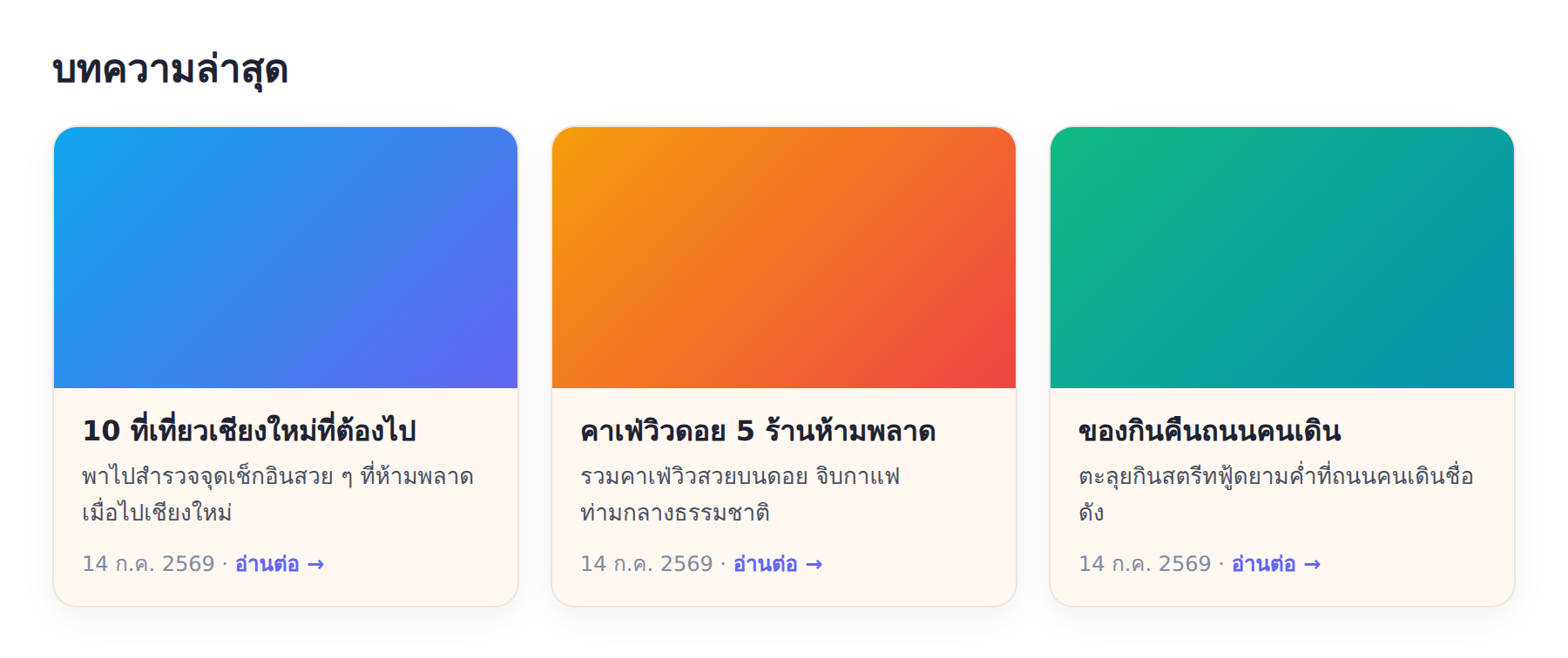
What a post grid is, and why it matters
A Post Grid is a section that shows the blog's posts as cards in a grid layout, usually on the homepage below the Hero. It is where readers explore content and decide which post to read. Each card has a cover image, title, excerpt, and date, so readers get an overview of a post before clicking.
The post grid matters because it is the "gateway" to your content. If the cards look interesting and are well laid out, readers want to click in. But if they are cluttered or dull, readers may scroll past. Designing the post grid to be attractive therefore has a direct effect on how many posts get read and on reader engagement.
Pulls from the feed automatically: cards that update themselves
BlogKub's post grid pulls posts directly from the Blogger feed, which means that when you publish a new post, it appears in the grid automatically. You do not have to add cards or links one by one. The system takes each post's cover image, title, excerpt, and date to build the card for you.
This is the advantage of working with the feed. Your site always looks alive and current. The latest post reaches the homepage the moment you publish it, unlike a fixed post list you have to update by hand every time. Using the feed lets your homepage take care of itself while you focus on writing content.
How to set up the post grid step by step
- Add or select the Post Grid block. Most templates include a Post Grid on the homepage. Select that block to edit, or add it yourself.
- Set the heading, columns, and count. Enter a section heading (such as "Latest posts"), choose the column count (2 to 4) and the number of posts to show.
- Adjust image, excerpt, and card style. Toggle the image and excerpt, set the read more button text (leave blank to hide), adjust the card corner radius, and choose a style between shadow, border, or flat.
- Export the XML and check the result. Click Export, upload it to Blogger, then check the cards display correctly and are responsive on both desktop and mobile.
Adjust the column count and card style to fit the site
The flexibility of the Post Grid lies in adjusting the card look to fit your design and site type.
- Column count (2 to 4): fewer columns (2) make the cards large and prominent, ideal for blogs where images matter. More columns (4) show more posts in one space, ideal for content-heavy sites.
- Card style: shadow gives a floating, modern feel; border gives a clean, clear look; flat gives a minimal simplicity. Choose to match your site's tone.
- Card corner radius: adjust the roundness of the corners. More rounded looks soft and friendly, squarer looks serious and formal.
- Image, excerpt, read more button: toggle as you like. An image-focused blog might feature a prominent image, while a text blog might emphasize the title and excerpt.
These adjustments help the post grid become part of your site's identity, not just a standard list that looks the same on every site. Try adjusting until you get a look that fits your brand and appeals most to your readers.
The importance of the cover image and excerpt
Because the card uses the cover image and excerpt from the post, these elements directly affect its appeal. A beautiful, meaningful cover image makes the card clickable, while a well-written excerpt tells readers what the post is about and why to read it. Paying attention to these two elements in every post helps the whole post grid look good and work well.
In practice, use a cover image of suitable size and proportions, and write a concise but enticing excerpt. If a post has no cover image, its card may look emptier than the others. Having an image on every post helps the grid look consistent and professional. Besides, good images and excerpts also affect sharing on social media, because they are often used as the preview image and text.
The post grid in a complete homepage system
The post grid works best as part of a homepage designed systematically. Generally a good homepage has a Hero welcoming at the top, followed by the post grid showing content, and perhaps other supporting sections. This ordering leads readers from the welcome to the content naturally.
Used together with a sidebar that helps navigate by category and read time shown on the cards, the post grid becomes a complete content discovery hub. Readers see the posts, know how long each takes to read, and easily choose based on interest, all of which increases the number of posts read per visit.
The post grid and site speed
Because the post grid pulls data from the feed and shows several images, the number of posts and image size affect homepage speed. Setting a reasonable number of posts (such as 6 to 9) balances showing enough content with keeping speed. The images in the cards are thumbnails and the system uses lazy loading in many cases, so it does not affect the first page open much.
What really matters is the file size of each post's cover image. If the image is very large, even when shown small in the card, the full file still has to download. Uploading cover images that are suitably resized and compressed helps both the post grid and the overall page load fast, which is good for both readers and Core Web Vitals scores, especially LCP, which is often affected by large images near the top of the page.
The post grid across different kinds of sites
The post grid adapts to almost any kind of site. Travel and food blogs where images are the star might use fewer columns for large cards showing beautiful images. News or knowledge blogs with many posts might use more columns to show more posts. Minimal blogs might choose a flat or border card style for clean simplicity. This flexibility makes the post grid an element that fits every site's identity.
Choosing settings that suit your site type helps the homepage communicate its identity at first glance. A reader entering a food blog and seeing large cards full of appetizing food images feels different from seeing a plain text list. Paying attention to adjusting the post grid to fit the content is therefore part of building an experience consistent with your brand.
Common problems and how to fix them
The post grid does not show
Check that the blog has published posts, because the grid pulls from the feed. If there are no posts yet, there are no cards to show. And check that you added/selected the block and Exported again.
The cards have no image
The cards use the post cover image. If a post has no cover image, its card has no image. We recommend adding a cover image to every post so the grid looks consistent.
The cards are too narrow on mobile
The system already reduces the column count on mobile. If it still feels narrow, try reducing the column count on desktop or check the display on a real screen.
You want to show only certain categories
The main post grid usually shows all latest posts. If you want to show only a category, consider using the latest/random posts section, which can filter by label, alongside it.
Best practices
- Add a good cover image and excerpt to every post, because the cards use these elements directly.
- Choose the column count and card style to fit your site type and how much images matter.
- Set a reasonable number of posts to keep speed and avoid an overly long homepage.
- Arrange the post grid as part of a homepage with a Hero and other elements systematically.
- Test the display on both desktop and mobile before publishing.
Wrapping up
The post grid is the content discovery hub on the homepage, where readers choose which post to read. With BlogKub you can set up the Post Grid fully with no coding. The system pulls posts from the feed automatically and shows them as cards with an image, title, excerpt, and date. You can adjust the column count, card style, corner radius, and the toggling of various elements, and it is responsive automatically. When you attend to the cover image and excerpt of every post and arrange the grid as part of a systematic homepage, your post grid draws readers to click into several posts, which raises engagement and helps your content get read more.
Frequently asked questions (FAQ)
Where does the Post Grid pull its data from?
It pulls from your own Blogger post feed, taking the cover image, title, excerpt, and date to display as cards, so it updates automatically each time you publish a new post, with no need to add links yourself.
Can I adjust the column count and card style?
Yes. You can choose 2 to 4 columns, adjust the card corner radius, and pick from 3 styles: shadow, border, and flat. You can also toggle the image, excerpt, and read more button as you like.
Is the Post Grid responsive on mobile?
Yes, it is responsive. On mobile the column count reduces automatically so the cards are not too narrow to read. The cards display nicely and are easy to read on both desktop and mobile with no separate setup.
How is the Post Grid different from latest/random posts?
The Post Grid is the homepage's main post section with detailed card customization (columns, style, excerpt, button), while latest/random posts is a supplementary section usually placed at the end of an article or elsewhere to invite reading on. Both pull from the feed alike.
Does the Post Grid help SEO?
It helps indirectly. Showing posts as attractive cards helps readers click into several posts, increasing engagement and internal linking, which are good signals for navigation and overall SEO.