
How to add a Sidebar (content plus side column) in Blogger
A sidebar is a side column that places supporting elements like categories, search, and archive beside the main content. It is a classic layout that aids navigation in content-heavy blogs. This article teaches you how to add one to a Blogger theme with BlogKub, which lays it out beside the content automatically, letting you choose the side and width, with commonly used widgets.
Quick summary: add the Sidebar Layout block in BlogKub near the post group, choose the left/right side, set the width, and enable the widgets you want (search, categories/labels, archive, about the author). The system arranges the sidebar beside the main content automatically on Export, and collapses it below on mobile so the content gets full space.
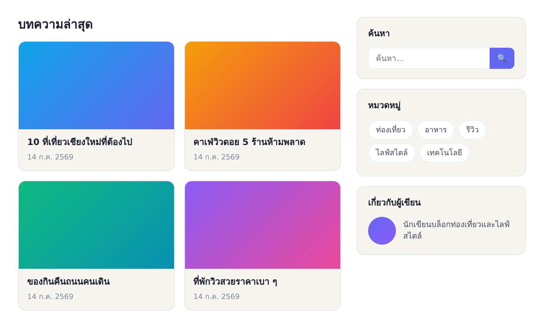
What a sidebar is, and who it suits
A sidebar is a vertical column placed beside the main content, used to show supporting elements such as search, categories, archive, and author information. It is a classic, familiar two-column layout where the main content takes up most of the space, while the sidebar is a narrow column that aids navigation and provides extra information.
A sidebar suits blogs with many posts and several categories, because widgets like categories and archive help readers explore the content easily. Conversely, blogs focused on focused long-form reading, or a minimal design, might choose a single-column layout so the sidebar does not pull attention from the content. Choosing to use a sidebar therefore depends on your site's nature and goals.
Laid out automatically: you do not arrange the columns yourself
What makes BlogKub's sidebar easy to use is that the system lays it out automatically. You do not deal with building a two-column structure yourself. Just place the Sidebar block near the post group (such as postgrid, postlist, or featured), and on Export XML the system arranges the sidebar beside the main content on the side and width you set.
This saves a lot of hassle, because building a two-column layout by hand in Blogger XML is complex and requires understanding section structure and CSS. BlogKub handling it means you get a correct, responsive sidebar layout just by choosing a few options, with no touching code at all.
How to add the sidebar step by step
- Add the Sidebar block. Open the left block library and drag the "Sidebar Layout" block near the post group (postgrid/postlist/featured), so the system knows beside which content to place the sidebar.
- Choose the side and width. Choose the sidebar on the left or right, and set the width, such as 280px, as suits your layout.
- Choose the widgets in the sidebar. Enable the widgets you want, namely search, labels/categories, archive, and about the author. Choose only what benefits your site.
- Export the XML and check the result. Click Export, upload it to Blogger, then check the sidebar sits beside the content correctly on desktop and collapses below the content on mobile.
The sidebar widgets and the benefit of each
A sidebar is valuable only when the widgets in it benefit readers. BlogKub has main widgets to enable.
- Search: lets readers search posts on the site from the sidebar, ideal for content-heavy sites. It uses the same idea as the search box placed elsewhere.
- Labels/categories: show the blog's categories for readers to click into posts in a category of interest, aiding topic-based navigation.
- Archive: organizes posts by time period, letting readers revisit old posts by month/year, ideal for blogs that publish regularly.
- About the author: shows the author's profile, building connection and credibility (E-E-A-T), letting readers know who wrote it.
The tip is to choose only the widgets your readers genuinely benefit from. A sidebar stuffed with everything until it runs long looks cluttered and diminishes the importance of each part. Having just the right widgets, arranged by importance, lets the sidebar do its job best.
The sidebar on mobile: collapses below automatically
The challenge of a two-column layout is that on mobile there is not enough room for two columns side by side. BlogKub solves this by collapsing the sidebar below the main content automatically on small screens, so the main content gets full width and is easy to read, while the sidebar widgets are still reachable when readers scroll down.
This handling matters because most readers come from mobile. If the sidebar did not collapse and squeezed the content narrow, reading would be painful. The system doing the responsive work automatically means you get the benefit of a sidebar on desktop without losing the mobile reading experience. This is design that considers every device from the start.
Choose a balanced side and width
Choosing the sidebar's side affects the feel of the page. A right sidebar is the most common classic, because it keeps the main content on the left where the eye starts reading, while a left sidebar feels like a navigation panel before the content, ideal for sites that emphasize navigation. Both work, so choose by the design and balance you want.
As for the width, around 280px is a sweet spot for a general sidebar. It is wide enough for widgets to show their content fully without feeling cramped, and not so wide that it steals space from the main content. Set too wide, and the main content gets squeezed and harder to read. Finding the balance between content space and the sidebar is the key to a good layout.
Sidebar vs single column: trends and choice
In recent years, many sites have shifted to a single-column layout focused on content, especially long-form reading blogs and minimal sites. The reason is that a single column helps readers focus on the content with no side distractions, and looks modern and clean. However, the sidebar is not obsolete. It still clearly benefits sites where navigation and content discovery matter, such as sites with hundreds of posts across several categories.
The choice is therefore not right or wrong, but a matter of goals. If your site wants readers to explore many posts and navigate by category, a sidebar helps a lot. But if the goal is for readers to focus on a single article to the end, a single column may fit better. The advantage of BlogKub is that you can choose either and switch as you like. Try which fits your readers and content best.
Common problems and how to fix them
The sidebar is not beside the content
Check that you placed the Sidebar block near the post group (postgrid/postlist/featured), because the system uses this position to arrange the sidebar beside the content. If placed far from the post group, the layout may not be as expected.
The main content is too narrow
You may have set the sidebar width too high. Try reducing the width (such as back to 280px) to return space to the main content.
The sidebar widgets do not show
Check that you enabled the widgets you want and Exported again. Some widgets, such as archive, show only when there are enough posts to group by time.
The sidebar looks cluttered on mobile
Because the sidebar collapses below, having many widgets makes the lower section long. Try reducing the widgets to only the essential ones so mobile stays compact.
Best practices
- Always place the Sidebar block near the post group, so the system arranges it beside the content correctly.
- Choose only widgets readers genuinely benefit from, do not stuff everything until the sidebar is long and cluttered.
- Set a balanced width (around 280px) so it does not squeeze the main content.
- Consider whether your site suits a sidebar or a single column, by the nature of the content.
- Use the search and category widgets together with breadcrumbs for a complete navigation system.
Wrapping up
A sidebar is a classic layout that aids navigation in content-heavy blogs by placing supporting elements like search, categories, archive, and author information beside the main content. With BlogKub you just place the Sidebar block near the post group, choose the left/right side, set the width, and enable the widgets you want, and the system arranges the sidebar beside the content automatically on Export and collapses it below on mobile to preserve the reading experience, with no touching code at all. When you choose genuinely useful widgets and set a balanced width, the sidebar helps readers explore your content more easily, which is especially suited to blogs that have accumulated many posts.
Frequently asked questions (FAQ)
Where is the Sidebar placed, and do I place it myself?
You do not place it manually. Put the Sidebar block near the post group (postgrid/postlist/featured), and the system arranges the sidebar beside the main content automatically on Export XML. You only choose the left or right side and the width.
What can I put in the sidebar?
There are widgets to enable, such as search, labels/categories, archive, and about the author (profile). Choose only what you want so the sidebar is useful without clutter.
How does the sidebar show on mobile?
On mobile with limited space, the sidebar collapses below the main content automatically, so the main content gets full width and is easy to read. Readers can still reach the sidebar widgets by scrolling down.
Left or right side, which is better?
It depends on the site style. A right sidebar is the classic, common choice and keeps content on the left following the reading flow, while a left sidebar feels like a navigation panel. Both work, so choose by design and page balance.
What kind of blog is a sidebar good for?
It suits blogs with many posts and several categories, because the sidebar aids navigation with categories, archive, and search. Blogs focused on simplicity or long-form reading might choose a single-column layout to focus on the content.