
How to add a Theme Color Picker letting readers change your site color in Blogger
What if readers could choose your site's color to their liking? A theme color picker gives readers that small power, creating a sense of ownership and fun in interacting. This article teaches you how to add one to a Blogger theme with BlogKub, with preset colors, remembering the choice, and the reasoning for why this feature is appealing.
Quick summary: add the Theme color block in BlogKub, then Export the XML and upload it to Blogger. You get a floating button readers click to open a color panel with several preset tones (indigo, rose, green, amber, blue, purple, gray, plus the original). When chosen, the site's accent color changes immediately, and it remembers the value in each reader's browser without affecting other readers.
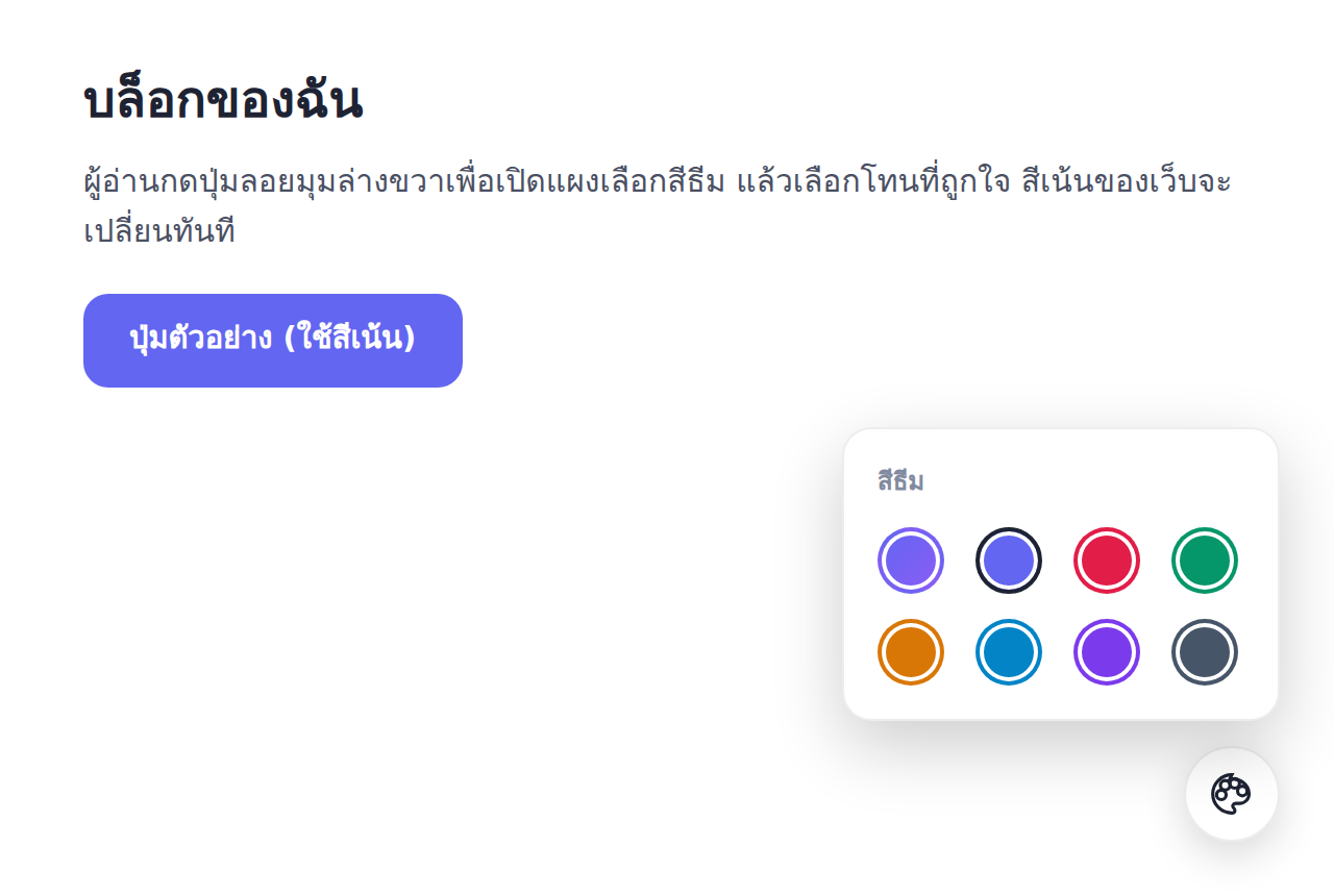
What the theme color picker is
A Theme Color Picker is a floating button that lets readers open a panel to choose the site's "accent color" themselves. The accent color is the main color that appears on important elements such as buttons, links, icons, and spots that draw the eye. When a reader picks a tone they like, these elements across the whole site change color immediately in real time.
This is a "personalization" feature that lets readers customize their own experience. Even though it is a small change, it creates a sense of engagement and fun. Some readers like a calming blue, some like a bright pink. Letting them choose makes your site feel "friendly" and attentive to each person's preference.
How it works: changes immediately and remembers
When you add this block, the system places a round floating button in the bottom right of the screen. When a reader clicks, a small panel opens with color previews as circles to choose from. When the reader taps a color, the system updates the site's main color variable immediately, so every element using the accent color changes in an instant, with no page reload.
The key point is that the system remembers the reader's chosen color in their browser, so when they return on the same device, the color they picked is still there, with no need to choose again every time. And because it is stored on the reader's side, one person's color change does not affect other readers or the site's default. Each person has their own color version.
How to add the theme color picker in BlogKub step by step
- Add the theme color block. Open the left block library and drag the "Theme color" block into the page, to place the floating button and color panel.
- Export the XML and upload. Click Export, then take the file to blogger.com → Theme → three-dot menu → Backup/Restore → select the XML file.
- Test the color change. Open the live site, click the floating theme color button, and choose various tones, checking that the site's accent color (buttons, links) changes immediately.
- Check it remembers after refresh. Refresh the page to confirm the chosen color stays, because the system stores the value in the reader's browser.
Preset colors: why not free color choice
BlogKub's theme color picker offers curated preset colors rather than free choice of every shade. This is a deliberate design decision, because each curated tone is paired to go together and read easily on the site's background, in both light and dark mode. If free color choice were allowed, readers might pick a color too faint to read, or one that clashes with the background and looks bad.
The available tones cover popular main colors such as indigo, rose, emerald green, amber, blue, purple, and gray, plus a "return to the original" option for the theme. This set is wide enough for readers to find a color they like, but not so many as to confuse, a balance between freedom to choose and the guarantee that the result always looks good.
Theme color picker vs dark mode: different dimensions, usable together
Many readers confuse the theme color picker with dark mode. Both are reader-side customization, but they do different things.
- Dark mode: switches the "brightness" of the background between light and dark, for comfortable reading in different lighting.
- Theme color picker: changes the site's "accent tone", for color preference and identity.
The two work in different dimensions and complement each other perfectly. A reader might choose dark mode with an emerald green accent, or light mode with pink, as they like. Enabling both features makes your site fully customizable in both brightness and color tone, letting readers design their own experience fully.
Benefits for engagement and a sense of ownership
A personalization feature like this has an interesting psychological effect. When a reader takes action to customize something on your site, even just changing a color, they feel more engaged and attached to it, because it becomes "their version" of the site. This small sense of ownership increases the chance they remember the site and return.
Besides, having a color picker also signals that your site is modern and attentive to detail, which affects the first impression and credibility. Used together with other experience-raising features such as dark mode and a reading progress bar, your site feels like a polished product, not just an ordinary blog.
A consideration: do not let floating buttons clutter
The theme color picker is a floating button in the bottom right, the same area other floating buttons often sit, such as a back to top button or a dark mode button in some layouts. If you enable several floating buttons at once, check that they do not overlap or crowd until it looks cluttered.
The recommendation is to enable only the floating features genuinely necessary for your site's experience. The theme color picker suits sites that want to emphasize fun and personalization, while sites focused on simplicity might choose not to enable it. Having the right features beats cramming everything in until the screen is full of buttons.
Examples of use in different kinds of blogs
- Personal and lifestyle blogs: fits a fun character, letting readers choose a color reflecting their mood.
- Tech and tool blogs: these readers love to customize, and a color feature matches their expectation of flexibility.
- Fashion and creative blogs: playing with color is part of the site's identity, and a color picker adds appeal.
- Portfolio sites: shows you care about detail and UX, which is a selling point for creative professionals.
Common problems and how to fix them
The floating button does not appear
Check that you added the theme color block and Exported again. The button floats in the bottom right. If another floating button is in the same spot, you may need to check they do not overlap.
Choosing a color does not change some parts
The color picker changes the "accent color" used on buttons, links, and main elements. Elements with their own fixed color may not change, which is normal when using the accent as a central variable.
The chosen color is lost after clearing browser data
This is normal behavior, because the chosen color is stored in the browser. If the reader clears the site data, the value returns to the theme's default.
You want to lock the default color to the brand color
You can already set the theme's default color in BlogKub. The color picker is just an extra option for readers. The default that new visitors always see first is the brand color you set.
Best practices
- Set the theme's default color to your brand color, with the color picker as an extra option for readers.
- Enable the color picker when your site emphasizes fun and personalization, not every site needs it.
- Be careful not to let several floating buttons overlap into clutter, enable only what is necessary.
- Use it together with dark mode so readers can adjust both brightness and color tone.
- Test that every selectable tone still reads easily in both light and dark mode.
Wrapping up
The theme color picker gives readers a small customization power, changing the site's accent color to their liking in a few clicks. With BlogKub you just add the theme color block and Export it to use, and readers get a floating button that opens a panel of several preset tones, and choosing one changes the site color immediately and remembers the value in their own browser without affecting others. This feature creates a sense of engagement and ownership, makes the site feel modern and detail-attentive, and used together with dark mode, lets readers design their own experience fully in both brightness and color tone.
Frequently asked questions (FAQ)
What does the theme color picker do?
It is a floating button that lets readers open a panel to choose the site's main (accent) color themselves. When they pick a tone, the site's accent color across the whole page changes immediately, such as buttons, links, and elements using the main color, letting readers adjust the site's look to their liking.
How many colors are there to choose from?
There are several preset tones to choose from, such as indigo, rose, emerald green, amber, blue, purple, and gray, plus an option to return to the theme's original color. It covers the popular main tones without confusing readers with too many choices.
Is the reader's chosen color remembered?
Yes. The system stores the reader's chosen color in their browser. When they return on the same device, the color they picked is still there, giving a continuous experience without choosing again every time.
Does one reader's color change affect other readers?
No. The color change is each reader's own value stored in their own browser. Other readers and the site's default do not change. As the site owner, you still set the default color as usual.
How is the theme color picker different from dark mode?
Dark mode switches between a light and dark background for comfortable reading, while the theme color picker changes the site's accent color. They are different dimensions of reader-side customization and can be used together, so readers can adjust both brightness and color tone.