
How to build a Pros/Cons box + review score (Verdict) in Blogger articles
A good review article needs a spot where the reader sees the overview at a glance. The pros/cons box and the summary score box are the heart of that. This article teaches you how to add Pros/Cons and Verdict boxes to a Blogger theme with BlogKub, which lay out two columns with icons and stars automatically, ideal for any kind of review blog, plus how to use them and fixes.
Quick summary: add the Pros/Cons + review score block in BlogKub, then Export the XML and upload it to Blogger. In the post (HTML view) place a <div class="bk-pc"> for pros (bk-pros) and cons (bk-cons), and a <div class="bk-verdict"> for the summary score with stars. The system lays out two columns, check/cross icons, and stacks to a single column on mobile automatically.
Why a review article needs a summary box
Most review readers are "deciding", not just seeking knowledge. They want to know quickly what is good, what is bad, and whether to buy in the end. A common behavior is scrolling to find the summary box or score before reading all the details. The Pros/Cons and Verdict boxes answer this directly, summarizing the key points at a glance.
These boxes also make your article look professional like top review sites. Part of a review's credibility comes from a systematic presentation. When readers see clearly organized pros and cons and a reasoned summary score, they feel the review was considered thoroughly, not just an offhand opinion.
Two parts: Pros/Cons and Verdict
This feature gives two kinds of box that work together in a review article.
The Pros/Cons box
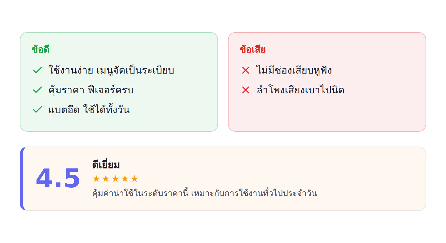
Two columns side by side. The left is "pros", a green background with a check icon. The right is "cons", a red background with a cross icon. Each column can hold several items, and the system adds an icon before each line automatically, so readers compare pros and cons in a single view.
The Verdict box
A horizontal box showing a large numeric score on the left (such as 4.5), a summary heading (such as "Excellent"), a row of gold stars, and a short summary about the product. This box is ideal as the closing summary of a review, giving readers a clear final verdict.
How to add and use the Pros/Cons + Verdict boxes, step by step
- Add the Pros/Cons block. Open the left block library, category "Article & UX", and drag the "Pros/Cons + review score" block in to embed the review box styles in the theme.
- Export the XML and upload. Click Export, then take the file to blogger.com → Theme → three-dot menu → Backup/Restore → select the XML file.
- Place the boxes in the review post. In HTML view, place the pros/cons box with a
<div class="bk-pc">containing a<div class="bk-pros">and a<div class="bk-cons">inside, each with a heading and a ul/li list, and place the score box with a<div class="bk-verdict">. - Check the display. Open the live article to confirm the pros box (green), cons box (red) with check/cross icons, and the score box with stars display correctly on both desktop and mobile.
Design that aids comparison
The detail that makes the Pros/Cons box work well is using color and icons that convey meaning immediately. Green with a check says "this is a pro", red with a cross says "this is a con". Readers understand without even reading the heading. Placing two columns side by side also lets the eye sweep and compare easily, unlike writing pros and cons mixed into a long paragraph.
The check/cross icons in the box are SVG embedded in the theme's style, not loaded images, so they display sharply at any resolution and do not affect speed, like the Callout box that uses the same approach, keeping your whole site's element style consistent and light.
The score box and clarity of the verdict
The large numeric score in the Verdict box acts as an "eye-rest" that gives the fastest answer in the article. A reader in a hurry may look at just the score and stars to decide, while a thorough reader reads the accompanying summary to understand the reasons. Having the number, stars, and explanation in one box therefore serves both kinds of reader.
What matters is scoring reasonably and consistently with the content. If you write several cons but give a full score, readers feel the review is insincere. Conversely, a score reasonable against the pros and cons presented reinforces credibility, which is the heart of a sustainable review blog.
On schema: do it correctly
Many people want reviews to show stars in Google results, which requires Review/Rating schema. BlogKub's Pros/Cons and Verdict boxes focus mainly on formatting content for easy, attractive reading. If you want full review schema, use BlogKub's review template designed for this, or add schema in the post based on real data.
An important caution is that Google has strict policies on Review schema. Add it only when it is a genuine review of your own and matches the displayed content. Adding score schema that does not match the content may be seen as violating the guidelines and do more harm than good. Correctness and honesty come first always. When done right, the good reader experience from these boxes already has a positive effect on being cited by AI and Google.
Examples of using it in different kinds of review blog
- Tech product reviews: pros and cons of specs and real use, with an overall score readers look for.
- Restaurant/cafe reviews: pros for taste and atmosphere, cons for price or parking, with a summary score.
- Stay/hotel reviews: pros for the view and service, cons for the travel, helping readers decide to book.
- Course/book/app reviews: pros and cons of content and value, with a verdict on who it suits.
Whatever the review, the "pros, cons, verdict" structure is a formula readers are familiar with and expect. These boxes help you present that formula attractively and consistently in every article.
Balance is the heart of a credible review
What separates a review people trust from one that looks like an ad is "balance". A review full of pros with no cons at all makes readers doubt how sincere it is. The Pros/Cons box forces you to think about both sides systematically, a good habit for a reviewer. Daring to state cons honestly, even small ones, actually raises credibility, because it shows you assessed impartially.
In the long term, this honesty is what builds a loyal reader base. A reader who feels your review genuinely helps them decide, not just pushes them to buy, comes back for your next review and recommends it. The Pros/Cons box is therefore not just a visual element, but a tool that encourages ethical reviewing, the foundation of a review blog that grows sustainably.
Common problems and how to fix them
The boxes have no color or icons
Check that you added the Pros/Cons block and Exported again, and use the correct class names (bk-pc, bk-pros, bk-cons, bk-verdict) written in the post's HTML view.
The two columns do not sit side by side
Check that the bk-pros and bk-cons boxes are inside the same bk-pc. On mobile the boxes stack into a single column by design for easy reading, which is normal.
Stars or score do not show
The score, stars, and summary are text you write in the bk-verdict box. Check that you included the full structure per the example, with no odd formatting tags mixed in from the compose view.
Best practices
- Place the Pros/Cons box first, then the Verdict box, for a natural reading order.
- Score consistently with the pros and cons presented, to keep credibility.
- Write pros and cons concisely as items, so they are easy to scan.
- Add Review schema only when it is a genuine review matching the content, per Google's guidelines.
- Pair with a Callout box and an FAQ box to make review articles complete and easy to read.
Wrapping up
The Pros/Cons and Verdict boxes are key elements that make your review articles answer the needs of deciding readers. With BlogKub, you just add the block and Export it, then place the boxes with the bk-pc class for pros and cons and bk-verdict for the summary score. The system lays out two columns, adds check/cross icons, shows the score and stars, and stacks to a single column on mobile automatically. Presented sincerely and consistently with the content, these boxes make your reviews look professional, credible, and help readers decide with confidence.
Frequently asked questions (FAQ)
How do I use the Pros/Cons box?
In the post's HTML view, place a <div class='bk-pc'> with two inner boxes: pros (bk-pros) and cons (bk-cons). Put items in each as a ul/li, and the system adds check/cross icons and lays out two columns automatically.
What is in the review verdict box?
The Verdict box shows a large numeric score, a summary heading (such as Excellent), a row of stars, and a short summary about the product. Place it with a <div class='bk-verdict'>, ideal as the closing summary of a review.
Do the review boxes become a single column on mobile?
Yes. On small screens the pros/cons boxes stack into a single column automatically for easy reading, without being squeezed too narrow.
Does this box create Review schema automatically?
The Pros/Cons and Verdict boxes are content formatting for easy, attractive reading. If you want full Review/Rating schema, use BlogKub's review template, or add schema in the post based on real data, for correctness.
What do Pros/Cons boxes help with in a review article?
They summarize the pros and cons so a reader who is deciding sees the overview quickly. Many people scroll to find the summary box before reading everything, so a clear box raises satisfaction and helps the decision.