How to build Callout boxes (Note / Tip / Warning) in Blogger articles
Easy-to-read articles usually have eye-rest spots that make important information stand out. A Callout box is that tool: a colored box with an icon that tells readers at once "this is a tip" or "this is a warning". This article teaches you how to add all 6 Callout boxes to a Blogger theme with BlogKub, including how to place them in the post and fixes.
Quick summary: add the Callout box block in BlogKub, then Export the XML and upload it to Blogger. In the post (HTML view) wrap text in a <div class="bk-tip">…</div>, choosing from 6 classes (note, tip, success, warning, danger, download). The system handles the color, SVG icon, and left border automatically, with no image loading and dark mode support.
What a Callout box is, and why it helps reading
A Callout box is a highlight box separated from the normal content by a background color, a left border, and an icon, to draw attention to important information such as a tip, warning, or note. A reader sweeping through an article hits these boxes at once, so they do not miss the point you want to emphasize.
In good writing, not every sentence carries the same weight. Some information is just general explanation, while some is a key point that, if missed, could lead to a mistake. Callout boxes create a "visual hierarchy" that tells readers what deserves special attention, making long content much easier to digest.
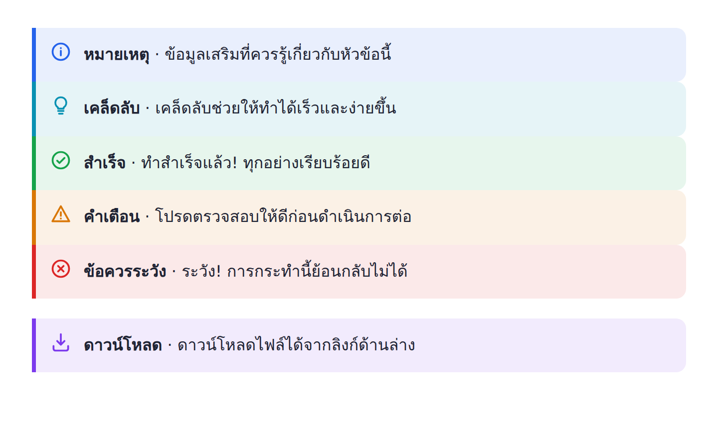
All 6 Callout box types and when to use them
BlogKub offers 6 Callout boxes, each with a color and icon that convey meaning by universal convention.
- Note (blue): for supporting information worth knowing but not urgent, such as extra context or an aside.
- Tip (teal): for a technique that makes something faster and easier, a box readers usually love because it adds value.
- Success (green): for confirming something is done right or a step is complete, giving readers confidence.
- Warning (orange): for something to be careful of or check before continuing, preventing mistakes.
- Danger (red): for important matters that are hard to reverse if missed, such as an action that permanently deletes data.
- Download (purple): for pointing to a file or resource to download, making the download link stand out.
Using color to match meaning matters. Readers learn from experience that red is danger and green is success. When you use the boxes consistently with these meanings, readers understand at once without even reading the label.
How to add and use Callout boxes, step by step
- Add the Callout block. Open the left block library, category "Article & UX", and drag the "Callout box" block in to embed the styles of all 6 boxes in the theme.
- Export the XML and upload. Click Export, then take the file to blogger.com → Theme → three-dot menu → Backup/Restore → select the XML file.
- Place a box in the post. When writing the post, switch to HTML view and wrap your text in a
<div class="bk-tip">tip text</div>, changing the class to bk-note, bk-warning, bk-danger, etc. as needed. - Check the display. Open the live article to confirm the box shows the background color, icon, and left border correctly by type, and reads well on both desktop and mobile.
Why the icons are SVG embedded in the theme, not loaded images
The technical detail that makes BlogKub's Callout boxes fast and stable is that the icons are embedded as SVG directly in the theme's style, not images loaded externally. The upside is that icons display at once with the content, with no flicker or wait, no extra network request, and no risk of the icon disappearing if an image link breaks.
This is in line with the Blogger principle that everything should live in the theme itself as much as possible. Using SVG embedded in the style also keeps icons sharp at every screen resolution and lets them change color by box type without needing several image versions, an approach both light and flexible.
Callout boxes with dark mode and design consistency
Because the text in the box uses the theme's color variables, Callout boxes adapt to dark mode naturally. The text changes to a light color in dark mode and a dark color in light mode, while each type's background and border use a transparent color, blending with the background in both modes while keeping the color identity.
This consistency matters for the site's image. When every box type has the same style across the site (margins, rounded corners, icon position), readers perceive that your site is designed systematically, unlike each article having differently shaped boxes made by hand one at a time. Having a central style embedded in the theme guarantees this consistency automatically.
Examples of using Callout boxes in different kinds of blog
- Tutorial/how-to blogs: use a tip box for shortcuts, a warning box for where people often slip, and a danger box for hard-to-reverse steps.
- Tech blogs: a note box for extra context, a download box pointing to a code file or resource, pairing well with the copy code button.
- Recipe blogs: a tip box for tricks to make it tastier, a warning box for timing or temperature to watch.
- Review and buying guide blogs: a note box summarizing key points, a success box confirming which option is worth it.
The common thread is that Callout boxes help separate "information to emphasize" from general content, making your article look organized and friendly to readers who like to scan for the key points.
A caution: do not overuse the boxes
Callout boxes are powerful because they stand out, but if you use too many in one article, everything stands out until nothing does, turning the article into a dazzle of colored boxes harder to read than before. The principle is to use boxes only for genuinely important information, a few points per article, to preserve their power to draw the eye.
Think of a Callout box like a highlighter in a book. If you highlight every line, highlighting is meaningless, but if you highlight only the key sentences, they stand out and are useful. Callout boxes are the same. Use them in moderation so they can do their job fully.
Callout boxes and accessibility
One benefit of using Callout boxes based on real text is that they are accessibility-friendly. The content in the box remains normal HTML text that a screen reader reads in full, unlike making a highlight box by embedding text in an image, which a reader who cannot see cannot access at all. Because the color and icon are only a CSS enhancement, not carrying all the meaning, the content stays accessible even when the style does not load.
That said, be careful not to rely on "color" alone to convey meaning, because some readers are color-blind. The good way is to have the box text convey the context itself, such as starting with "Caution:" or "Tip:", so the meaning is clear even to readers who cannot tell the colors apart. This is an inclusive design principle that covers all readers and aligns with good web accessibility standards.
Common problems and how to fix them
The box has no color or icon, showing as plain text
This usually happens because the Callout block was not added in the theme or was not re-exported. Check that you added the block and uploaded the latest theme, then confirm you used the correct class name, such as bk-tip not just tip.
You added the class but the box is off
Check that you wrote it in the post's "HTML view", not the compose view, because the compose view may convert tags or insert extra tags, breaking the box structure.
You want a color other than the 6 types
The set of 6 covers the main frequently-used meanings and is designed to be consistent. We recommend choosing from this set for consistency, rather than creating a new color that could make the design unsystematic.
Best practices
- Use color to match meaning, such as red for danger and green for success, so readers understand at once.
- Use boxes only for a few important points per article, to preserve their power to draw the eye.
- Always write the class in HTML view, and check the class name is correct (bk-note, bk-tip, ...).
- Test the display in both light and dark mode, and on mobile.
- Pair with other content features, such as the FAQ box and table of contents, to make long articles easy to read in every dimension.
Wrapping up
Callout boxes are a small tool that clearly raises an article's readability. With BlogKub, you just add the Callout box block and Export it, then wrap text in a div with the matching class (note, tip, success, warning, danger, download). The system handles the color, SVG icon, and border automatically, with no image loading, dark mode support, and consistent design across the site. Used in moderation to highlight important information, Callout boxes help readers scan for the key points quickly, understand easily, and have a better reading experience.
Frequently asked questions (FAQ)
How many types of Callout box are there?
There are 6 types: note, tip, success, warning, danger, and download. Each has its own color and icon to convey meaning at once.
Is it hard to add the code?
Not hard. Just wrap the text in a div with the matching class, such as <div class='bk-tip'>text</div>, in the post's HTML view. The system handles the color, icon, and border automatically, because the style is embedded in the theme.
Where do the box icons come from, do I need to load images?
No image loading. The icons are SVG embedded directly in the theme's style, so they display at once with no external file and no impact on page speed.
Do Callout boxes support dark mode?
Yes. The text in the box uses the theme's color variables, so it adapts to light/dark mode, while each type's background and border use a transparent color, staying readable in both modes.
How do Callout boxes help reading and SEO?
They help readers scan for the key points quickly, highlighting a tip or warning clearly, making content easier to read, which raises time on page and satisfaction, an indirect quality signal good for SEO.