How to build a Call To Action (CTA) box in a Blogger theme
A reader impressed by your content is ready to do something next, sign up, contact you, or view products, but if you do not tell them what to do, they usually will not. A Call To Action (CTA) box does that job. This article teaches you how to set one up in a Blogger theme with BlogKub, including the heading, button, link, background, and stats in some templates.
Quick summary: the Call To Action (CTA) block in BlogKub lets you add a heading, a button with a link (internal/external), choose a gradient/soft background, and in some templates (course/company) add subtext and stats. It leads the reader from reading to the action you want, then you Export it to use.
What a CTA is, and why every site should have one
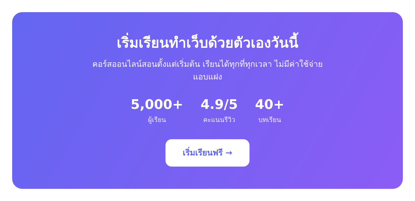
A Call To Action (CTA) is a box that invites the reader to do something, made of a motivating heading, subtext, and a button linking to a target page. For example, "Sign up for the free course", "Contact us today", or "View all products". A CTA is the bridge that turns a "reader" into a "doer" toward the site's goal.
The reason every site should have a CTA is the simple principle that "people tend to do what they are told to do". A reader who finishes the content feeling good but sees nothing to do next usually just closes the page. But with a clear CTA waiting, they have a direction to go. A CTA is therefore a key tool for turning interest into a result, whether your goal is a sale, collecting emails, or getting in touch.
How to set up a CTA box, step by step
- Add the CTA block. Drag the "Call To Action" block from the library into the spot you want, such as after the main content on the homepage, or at the end of an article.
- Add the heading, button, and link. Type a motivating heading, the button text, and the destination link, such as
/p/contact.htmlfor a contact page, or an external URL. - Choose the background (and stats). Choose a gradient (standout) or soft (subtle) background. In the course/company templates you can add supporting subtext and stats.
- Export the XML and test. Click Export, upload it to Blogger, then click the CTA button to confirm the link goes to the correct target page.
Write an effective CTA heading and button
A CTA's effectiveness depends mainly on the writing. The heading should motivate and state the value, not just say what to do. For example, "Start building a website for free today" is better than "Sign up", because it states both the action and the benefit. The subtext (if any) reduces hesitation by giving details or removing worries, such as "No cost, cancel anytime".
The button is the final decision point. Use words that state the action clearly and specifically, such as "Download free", "Reserve a seat", "Get a quote", which is better than a neutral "Click here" or "Submit", because a button that tells the reader what they get makes them click with confidence. The same principle applies to buttons in the Hero. Writing good CTAs is therefore a skill that affects the results of the whole site.
Choose a suitable background and position
The CTA background affects its prominence. A gradient background makes the box stand out and separate from the surrounding content, good when the CTA is an important goal you definitely want readers to notice. A soft background is subtle and blended, good when you do not want the CTA to be too aggressive or when there are several CTAs on one page.
Position matters just as much. A CTA usually works best at a moment of high motivation, such as at the end of an article when the reader finishes impressed, or after a section explaining the value of what you offer. Placing a CTA when the reader is "ready" makes it more effective than placing it at random. That said, do not have too many CTAs so the reader is confused about what to do. Having one clear main CTA with a single goal usually works better than stuffing several buttons to choose from.
Stats in some templates: adding credibility
In the course and company templates, a CTA can include subtext and stats, a powerful technique for prompting action. Stats like "Over 5,000 students" or "Trusted by over 200 companies" act as "social proof", telling the reader many people have decided already, which reduces hesitation and adds confidence.
Social proof works because people tend to see what others chose as likely good. Adding real, impressive stats to a CTA therefore raises the action rate. That said, the numbers must be true. Exaggerated stats can create distrust if the reader sees through them, so honesty matters above all. Used correctly, stats in a CTA are an effective decision accelerator.
The CTA and each kind of site's goal
- Email-collecting blog: a CTA to a Newsletter signup box or a signup page, to build a follower base.
- Company/service site: a CTA to a contact page or quote request, to generate leads.
- Online course site: a CTA to enroll or view course details, with student stats.
- Review/affiliate site: a CTA to view a product or a buy page, to turn readers into buyers.
You can see the CTA adapts to any site's goal. The key is knowing what you want the reader to do next, then designing the CTA to lead to that action clearly.
The psychology behind an effective CTA
An effective CTA is not accidental, it relies on understanding human behavior. The key principles are "reduce friction" and "increase motivation". Friction is what makes people hesitate, such as uncertainty about what happens when they click, or fear of wasting time or money. Writing a clear button and subtext that removes worries (such as "free", "no commitment") reduces this friction.
Motivation comes from stating a clear benefit and an appropriate sense of urgency. A CTA that says what the reader gets and why they should act now usually works better than a flat one. That said, urgency must be genuine and proportionate. Creating fake, exaggerated urgency can destroy trust. When you understand the balance between reducing friction and increasing motivation, you design a CTA that is both compelling and honest, which is the key to a CTA that works over the long term.
Test and improve your CTA
The best CTA usually does not come from guessing, but from observing and improving. Even though Blogger has no advanced testing tool built in, you can observe which kind of CTA seems to work with your readers. Try adjusting the text, position, or background color and see whether readers respond differently. Learning from real readers helps your CTA get better over time.
Remember there is no CTA formula that works for every site, because each audience is different. A CTA that works for a travel blog may not suit a business site. Experimenting and adapting to your own readers is therefore important. Start from good principles, then adjust based on what you observe. Do it consistently and your CTA will fit your readers and work better over time.
Common problems and how to fix them
The CTA button goes nowhere when clicked
Check that you entered the destination link in the button correctly, whether internal (such as /p/contact.html) or external (https://...), and Export again.
The CTA does not stand out enough
Try changing the background to a gradient to catch the eye, and check that the heading and button are motivating enough.
Stats do not show
The stats option is only in the course/company templates. If you use another template, this option is absent. Also check the stat format is correct (number | description, one per line).
Several CTAs confuse the reader
Reduce to one clear main CTA with a single goal per spot. A single clear goal usually works better than several competing buttons.
Best practices
- Write a heading that states the value and a button that states the action clearly. Avoid "Click here".
- Place the CTA at a moment of high motivation, such as the end of an article or after a value-explaining section.
- Choose a gradient background when you want it to stand out, soft when you want it subtle.
- Use real stats (in templates that support them) as social proof to prompt action.
- Have one clear main CTA per spot. Do not stuff several buttons and confuse people.
Wrapping up
The Call To Action box is a key tool for turning readers into doers toward the site's goal. With BlogKub, you set up a CTA easily with no coding, adding a heading, a button with a link (internal or external), choosing a gradient or soft background, and in some templates adding subtext and stats as social proof. The key to an effective CTA is writing a heading and button that state the value and action clearly, placing it when the reader is ready, and having one clear goal per spot. Done right, a CTA turns reader interest into the result you want, whether that is a signup, contact, or a purchase.
Frequently asked questions (FAQ)
What is a CTA?
A CTA (Call To Action) is a box that invites the reader to do something, with a heading, subtext, and a button linking to a target page, such as sign up, contact, or view products. It leads the reader from reading to the action you want.
Where can the CTA button link to?
It can link to both internal pages (such as /p/contact.html) and external links (such as https://...), so you can take readers to a contact page, product page, form, or other channel to match your goal.
Can I choose the CTA background?
Yes. Choose between a gradient (bright and eye-catching) and a soft background (subtle and blended), to make the CTA stand out or fit in with the content as you prefer.
Can the CTA include stats?
In some templates. The course and company templates support subtext and stats (such as number of students or customers), to add credibility and prompt action.
How should I write the CTA button?
Use words that state the action clearly and emphasize the benefit, such as 'Start learning free' or 'Contact us for a quote', which is better than a neutral 'Click here'. A good button tells the reader what they get by clicking, so they click with confidence.